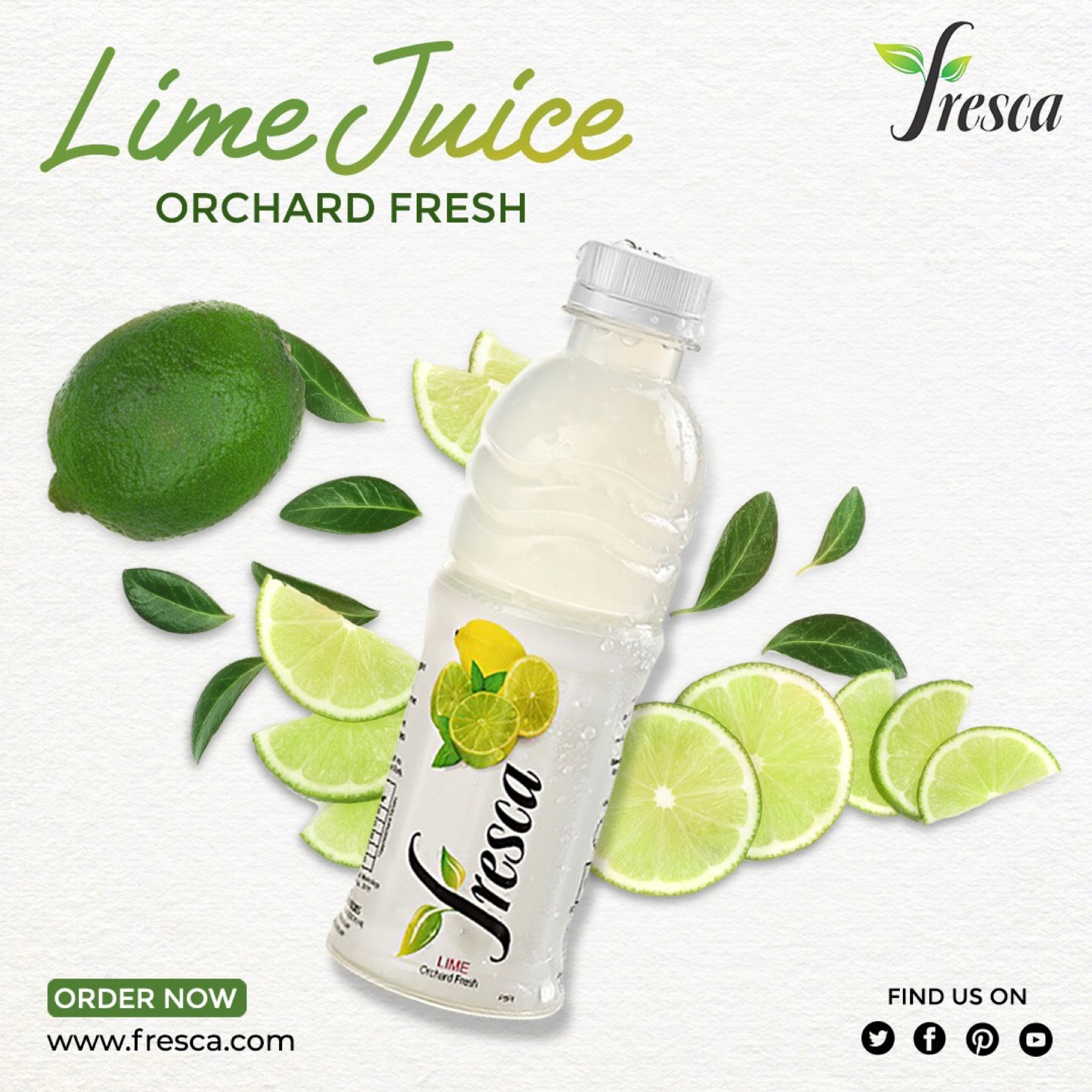
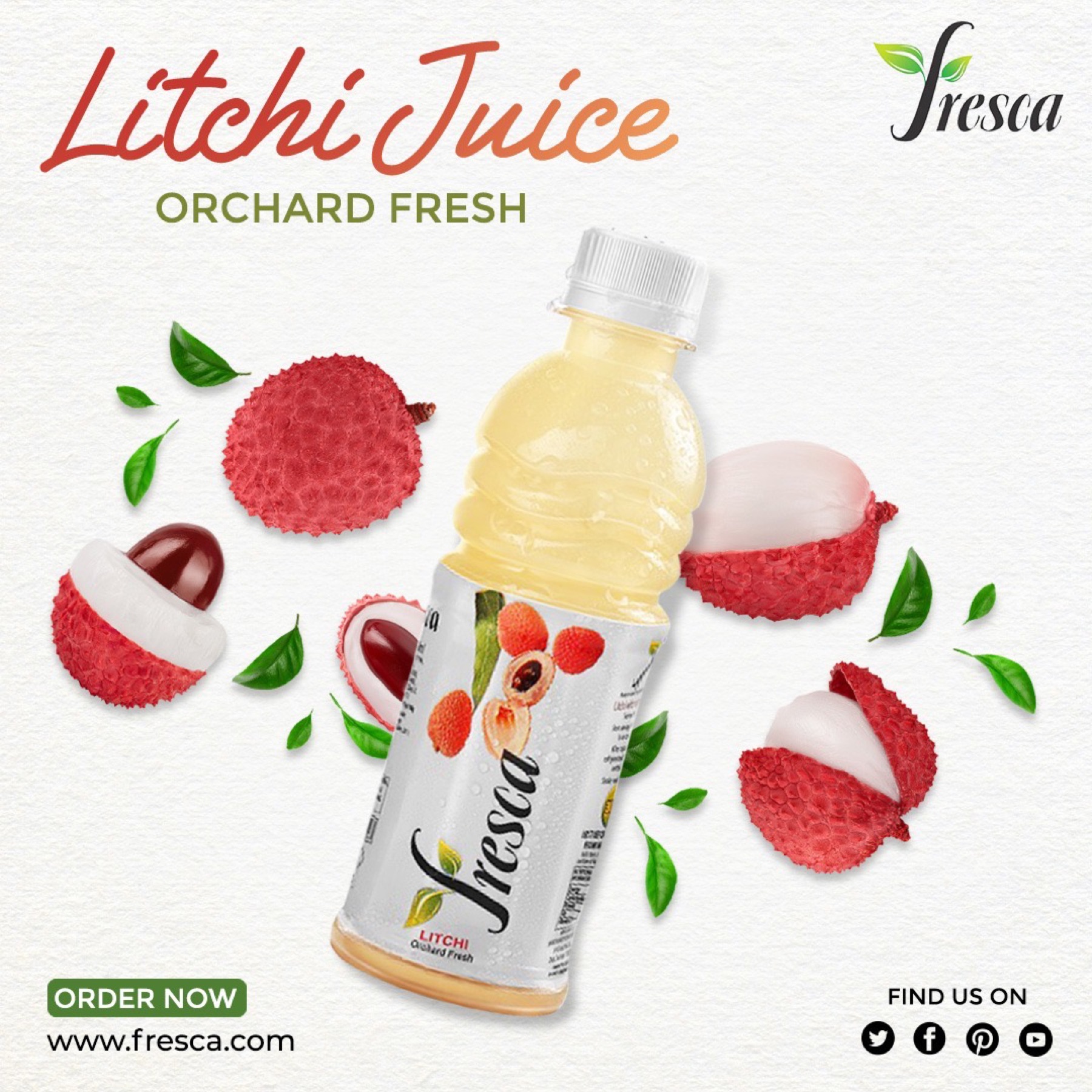
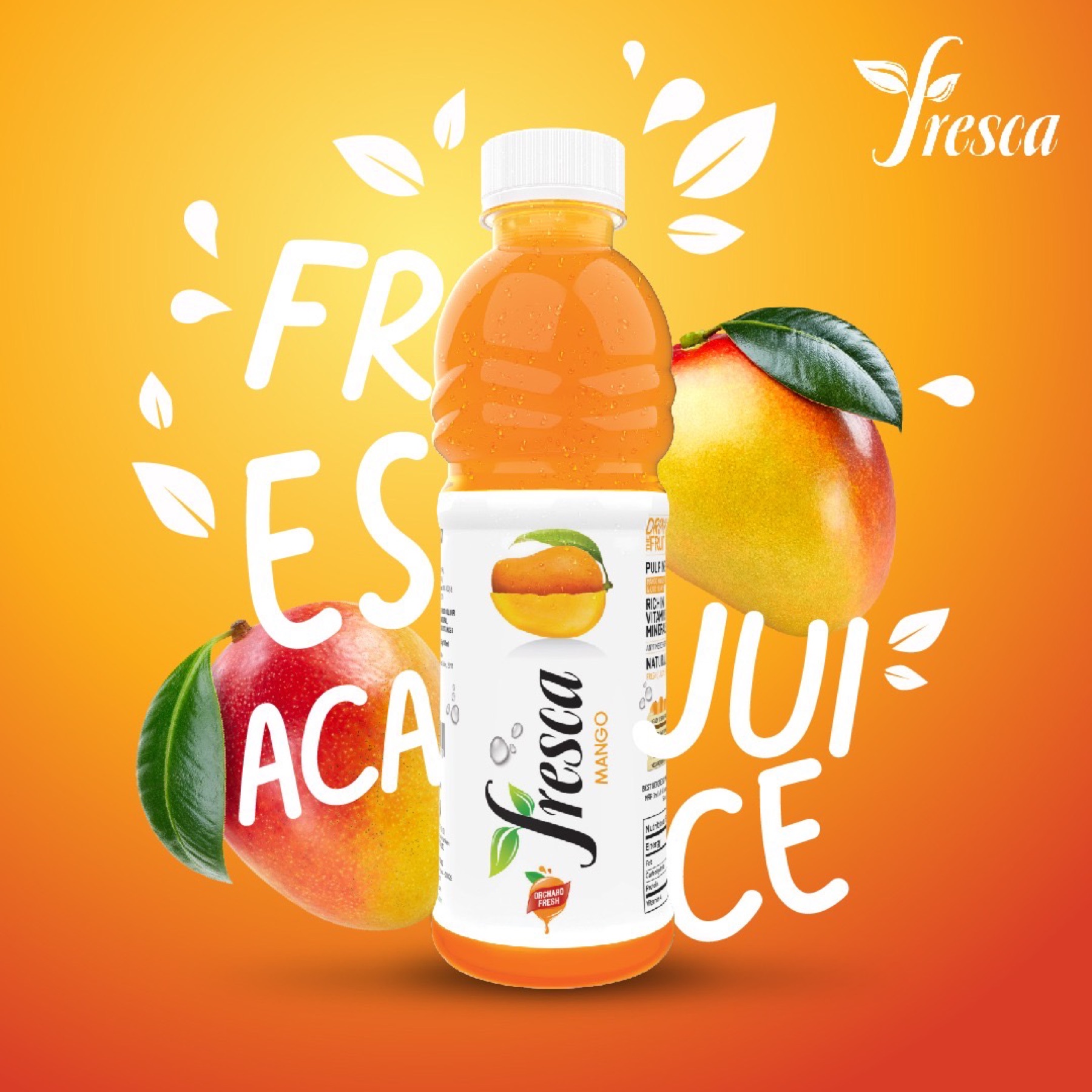
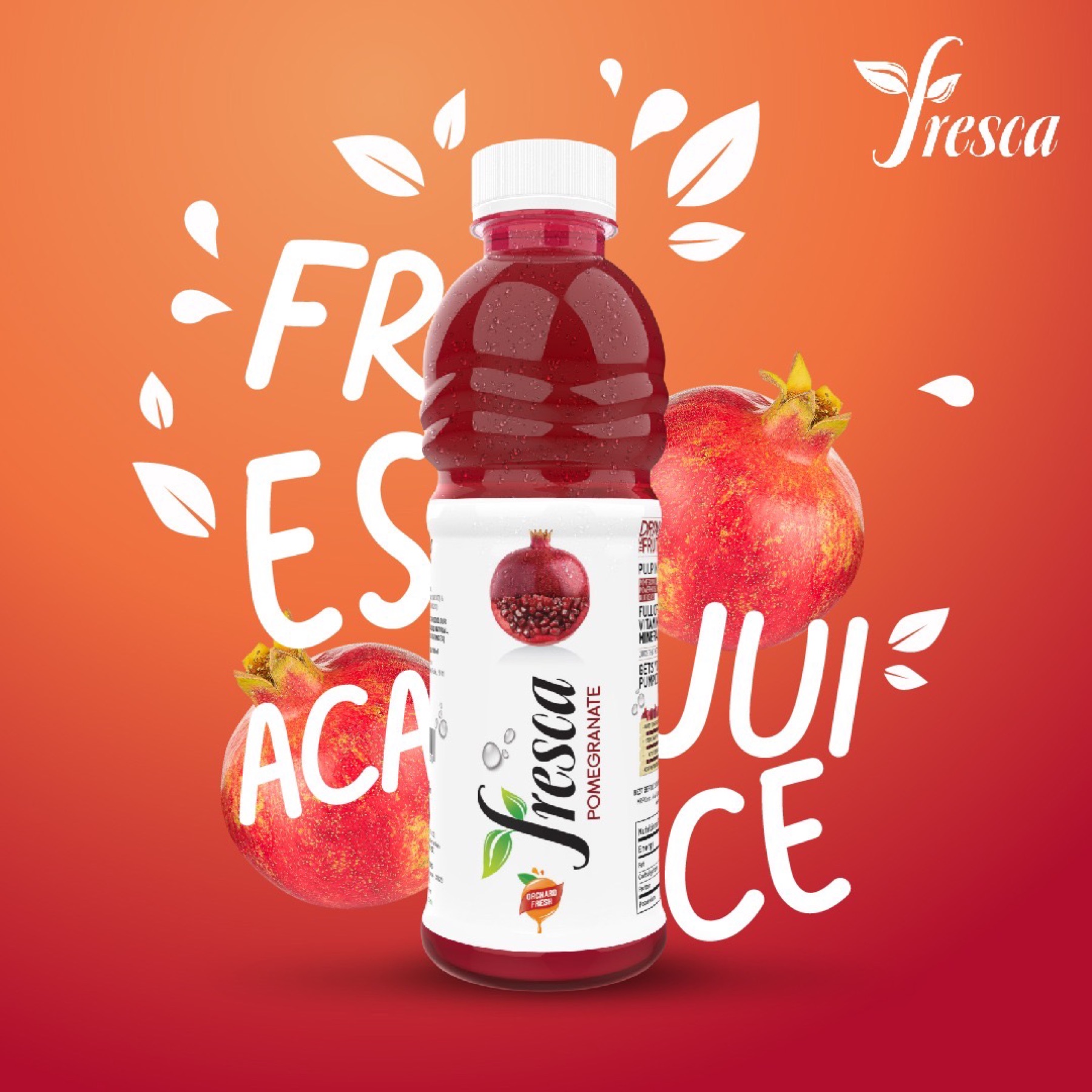
← Index 09 / 14
Nº 09 F&B / Beverage 2022

Fresca Juices

Visual programme for a cold-pressed juice line — flavor-led tile system, packaging direction and a retail and digital kit that earned a second look on the shelf.

Role

Account Lead, Packaging Direction, Visual Identity

Year

2022

Location

Delhi, IN

Timeline

6 weeks

Fresca Juices — orange flavor tile.
F&B / Beverage · Hero Fresca Juices
§ 01 · Challenge

The brief.

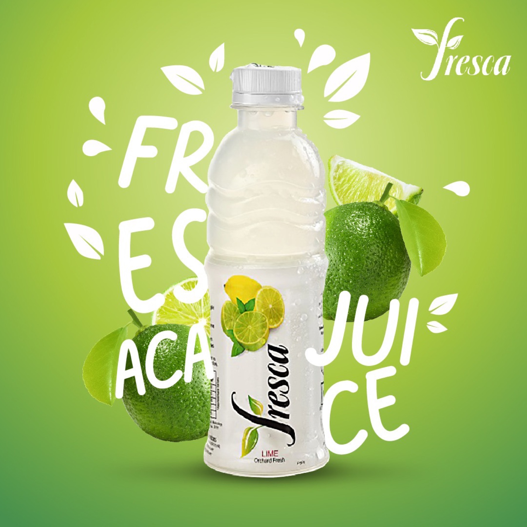
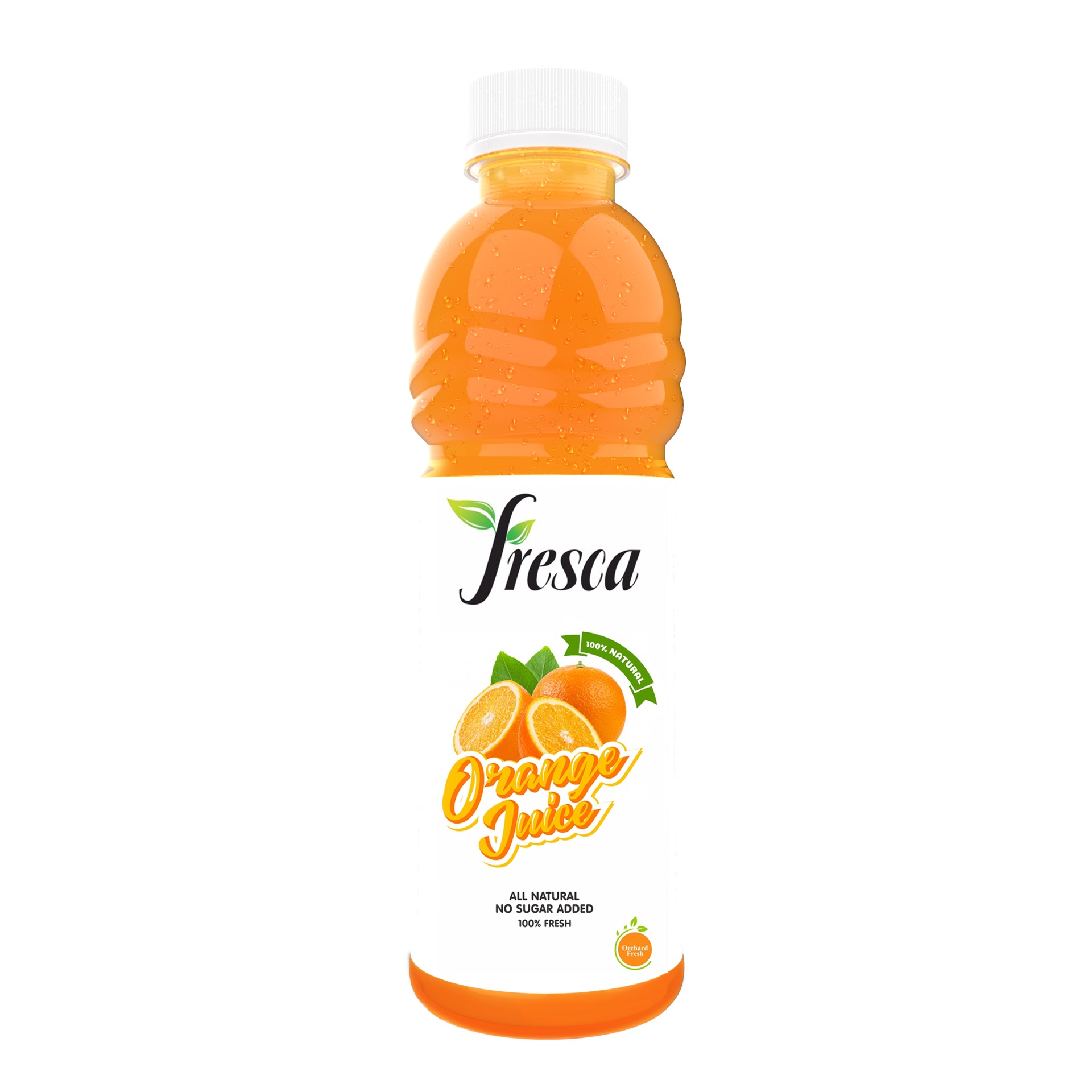
Fresca was bringing a cold-pressed juice line into a category where the shelf is loud and the audience is sceptical of every health claim. The brief was a visual programme that read as natural and orchard-fresh on a retail shelf and on a small mobile screen — without leaning on the genre's tired greens-and-leaves shorthand.

The harder problem was that the juices had to read as different from one another while still feeling like one brand. A consumer scanning the shelf needed to spot Lime, Litchi, Pomegranate or Mango in a single glance, with no name on the cap.

§ 02 · Approach

The work.

We built a flavor-led tile system — one bold colour and one hero ingredient per SKU, photographed close enough that the fruit did the work the copy didn't have to. Each visual locked a single dominant tone so the line read as a colour-bar across a shelf or feed.

The same kit was built to extend cleanly to retail collateral, social pitch tiles and the e-commerce listing pages, so the brand's first conversation with a consumer felt the same on the shelf as on the phone. Account work covered the visual direction, photography review and the packaging brief that carried the system into production.

§ 03 · Outcome
“The line shipped with a single visual voice across packaging and digital, the flavor-led system gave the brand a clear shelf identity inside a crowded category, and the kit became the template for subsequent SKUs as the range expanded. ”
Have a project in mind?

Say hello